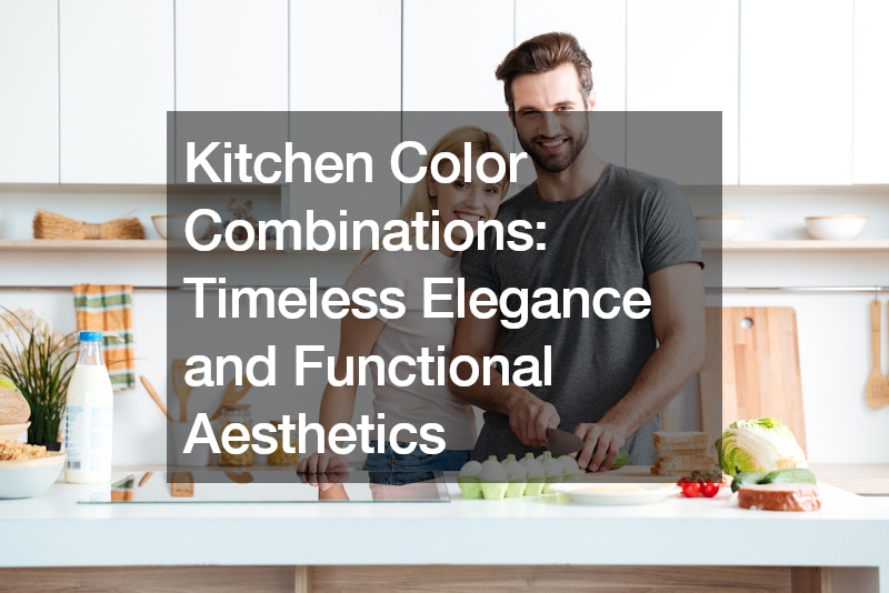
The kitchen is the heart of the home. It’s where meals are prepared, memories are made, and conversations flow freely. Choosing the right color scheme for this vital space is crucial. Colors not only impact the aesthetics but also influence mood and functionality. This guide explores popular kitchen color combinations that seamlessly blend timeless elegance with functional considerations.
Light and Airy Appeal: The Enduring Charm of Whites and Neutrals
For a timeless and light-filled kitchen, white reigns supreme. White kitchen cabinets create a sense of openness and cleanliness, making them ideal for smaller kitchens. However, to avoid a sterile feel, consider incorporating warmer whites or off-whites. This subtle shift adds depth and complements natural light. Textures also play a vital role in keeping the space inviting. Opt for textured cabinet finishes, subway tiles with a matte finish, or wooden countertops to add visual interest.
Beyond White: Embracing the Warmth of Wood Tones
While white offers a classic canvas, pairing it with natural wood tones like oak creates a sense of warmth and balance. This combination is perfect for achieving the quintessential Scandinavian aesthetic. Consider the undertones of the white you choose – a touch of cream or beige can further enhance the cozy feel of the wood.
Earthy Elegance: The Allure of Green and Walnut
Green kitchen cabinets are a bold yet sophisticated choice. When paired with rich walnut wood tones, the result is a luxurious and inviting space. This combination works particularly well in larger kitchens. Lighter shades of green can prevent the space from feeling overwhelming, while darker, moodier tones create a dramatic ambiance. Consider using lighter countertops and flooring to create a sense of balance, especially in smaller kitchens.
The Harmony of Tonal Neutrals: A Serene and Unified Space
For a kitchen that exudes tranquility and effortless elegance, explore a palette of tonal neutrals. This includes soft off-whites, gentle beiges, and warmer putty grays. A kitchen designed with this color scheme fosters a sense of calm and togetherness. The subtle variations within the neutral tones, coupled with contrasting textures like wood grains or stone countertops, add layers of visual interest without compromising the overall serenity.
A Timeless Classic: The Enduring Appeal of Blue and White
The combination of blue and white is a timeless kitchen staple. It creates a crisp, clean aesthetic that feels both vibrant and serene. Navy blue cabinets paired with crisp white walls exude sophistication, while lighter shades of blue with off-white create a more coastal vibe. The key to keeping this classic combination fresh is to avoid a literal nautical theme. Instead, focus on the balance of color and texture. Opt for unique hardware finishes, statement light fixtures, or pops of color on accent walls to personalize the space.
Dark and Dramatic: Embracing Luxury with Rich Colors and Accents
For a kitchen that oozes drama and luxury, consider a darker color palette. Deep blues, charcoal grays, or even a rich forest green paired with metallic accents create a bold and sophisticated statement. This color scheme is perfect for those who love a moody and intimate atmosphere. However, it’s crucial to strike a balance to avoid the space feeling cave-like. Introduce lighter elements like light wood flooring, white countertops, or large windows to ensure the space retains a sense of airiness.
Beyond Color: The Importance of Functionality
While color sets the tone for your kitchen, functionality should also be a top priority. Consider the following factors when choosing a color scheme:
- Lighting: Natural light plays a significant role in how colors appear. If your kitchen has limited natural light, avoid very dark colors, which can make the space feel cramped.
- Maintenance: Lighter colors, especially whites, can show dirt more easily. If you’re someone who prioritizes low-maintenance upkeep, consider darker colors or opting for textured finishes that hide minor imperfections.
- Traffic Flow: Kitchens with high traffic flow might benefit from colors that are slightly more forgiving of stains and splatters.
Creating a Cohesive Palette: Tips and Tricks
- The Rule of Three: Limit your color palette to three main colors to maintain a sense of balance and avoid overwhelming the eye.
- The Power of Samples: Always test paint and cabinet door samples in your kitchen with the existing lighting to ensure they appear as expected.
- Consider Adjacent Spaces: Think about how your kitchen color scheme will flow into adjoining rooms to create a cohesive feel throughout your home.
Conclusion
Your kitchen color palette is a reflection of your personal style and how you envision utilizing the space. By considering the timeless elegance of various color combinations and prioritizing functionality, you can create a kitchen that is both beautiful and practical, a space that will be the heart of your home for years to come.
.


